Visualizing Superstore Data Set
December 2021
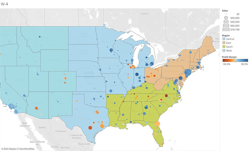
In the course titled, 'Visual Analytics with Tableau', provided by Coursera and the University of California, I was tasked with utilizing Tableau to create numerous amounts of plots using a database provided by a hypothetical superstore. These projects include creating customer scatterplots to visualize how much the company is profiting from each customer, which was colorized by profit ratio, sized by discount variables, with an added customer name to the Tooltip. I also charted shipping data and order-date data to visualize the orders that shipped out late, on-time, and early. Additionally, I created a dual layer map to show total profit by postal code, colorized by profit ratio, and sized by total sales while also showing Regions across the United States. All the charts are posted on Tableau Public (attached link below).